If you live in Denver and you are thinking about a fresh coat of paint outside, the short answer is this: look at your favorite restaurants for ideas, then adapt those ideas to your home. Color, lighting, texture, and small details that make a restaurant feel inviting can guide good choices for exterior painting Denver. You are already tuned into what feels welcoming when you walk up to a place to eat. The trick is to slow down, notice what works, and borrow it in a practical way.
Why restaurant design is a surprisingly good guide
Most restaurants cannot afford to guess. If the front looks dull, people just keep walking. Owners test color, lighting, and layout all the time, sometimes very quietly, because they need that first impression to work.
Your home has a different purpose, of course, but the basic question is similar: what do people feel when they walk up to the entrance? Calm, curious, relaxed, hungry for dinner? Or not much at all.
Good exterior paint choices are less about showing off and more about helping people feel comfortable arriving.
Think about how you react when you stand outside a restaurant for the first time:
- You notice the color of the front door without meaning to.
- You read the sign, and your eyes follow the trim around it.
- You sense if the lighting is harsh, cozy, or just flat.
- You decide in seconds if you want to step inside.
Your guests do something similar at your home. They may not say anything, but their eyes track the same way. Color, contrast, and simple lines guide that path.
Step one: look at restaurant exteriors with fresh eyes
Before you buy paint for your siding, it helps to look at real places, not just color cards. Next time you go out to eat in Denver, give yourself two or three minutes in the parking lot.
Ask yourself a few questions.
What are the main colors and where do they sit?
Try to name the base color from a distance: warm white, charcoal, soft green, dark blue, tan, or something else. Restaurants often keep the main body simple and calm, then push personality into accent areas.
Most good restaurant exteriors use one quiet base color and one or two stronger accent colors, not five competing shades fighting for attention.
Look at:
- Siding or main wall color
- Trim around windows
- Door color
- Sign color and frame
You will usually see one color in charge, one color supporting, and one color for small emphasis. Your house can follow the same pattern without feeling like a business.
How does the lighting affect the color?
Denver has strong sunlight during the day and deeper shadows late afternoon. Many restaurant owners know this from painful experience. A color that looked rich on a small swatch can look washed out at high noon.
Notice how the restaurant looks:
- In bright midday sun
- In softer early evening light
- Under exterior lights at night, if they are on
Try to see if the color still feels intentional at all three times. Good paint choices do not disappear at noon or turn strange at dusk.
What small details pull the eye to the entrance?
Restaurants want you to walk in without confusion. Your eye often follows a simple path: parking area, walkway, door. Color and trim usually guide that line.
Watch for things like:
- Darker color framing the entrance
- Brighter or richer color just on the door
- A painted sign or logo that echoes the door color
- Consistent trim color tying windows and door together
You can use the same idea at home, just toned down.
Translating restaurant color strategies to a Denver home
Restaurant designers work with three basic paint zones. This lines up nicely with a typical house.
| Restaurant element | Home equivalent | Usual color role |
|---|---|---|
| Main facade / walls | Siding / stucco / brick | Base color, calm and steady |
| Frames, columns, trim | Window trim, fascia, gutters, posts | Contrast color, defines shape |
| Door, sign, accents | Front door, shutters, railings | Accent color, personality spot |
Base color: what restaurants can teach here
Many restaurants pick warm neutrals or muted deep colors for their main walls. They live with weather, dust, and constant foot traffic, which is not far from what your exterior deals with in Denver.
Think about:
- How a color hides or shows dirt from late snow or spring storms
- How it looks against Denver sky, which can be very bright blue
- How heat and cold swings might age that color over time
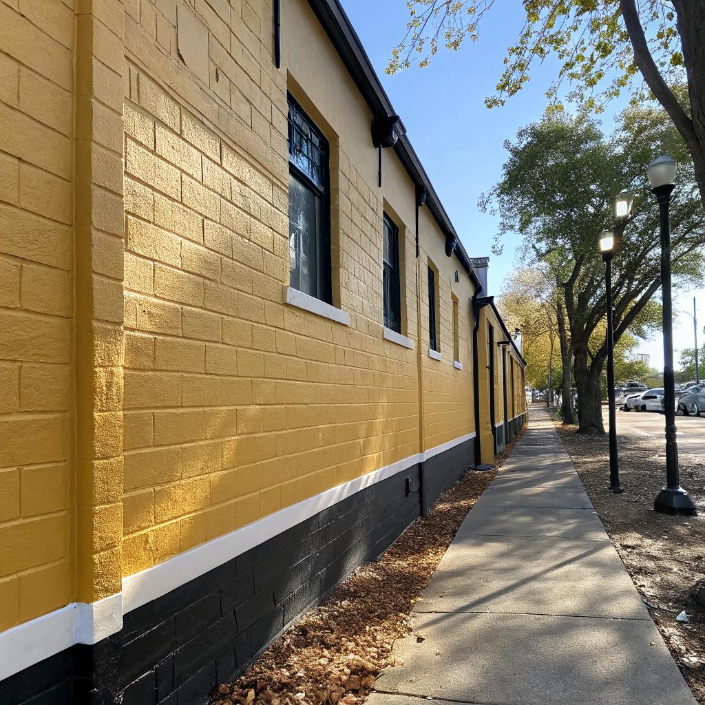
In my own neighborhood, one place tried a very bright yellow exterior for a cafe. It looked cheerful on day one. By the second winter, it felt tired and faded, and every smudge stood out. A calmer, slightly darker yellow would have aged better. Houses can fall into the same trap.
If a color looks too loud on a busy restaurant strip, it will usually feel even louder on a quiet residential street.
Trim color: like a restaurant frame
Trim is where restaurants often get clever. A darker frame against light walls can make a place feel grounded and clear. A lighter trim around darker walls can make the building feel taller and less heavy.
On a Denver home, trim can help:
- Highlight architectural lines you like
- Quiet down awkward shapes by using less contrast
- Tie together windows that are not perfectly matched
Look for restaurants where the trim color supports the story. For example, a modern noodle shop might use thin black trim around big windows, while a cozy bakery uses soft cream trim on a muted wall. Both work, but they send different signals.
Accent color: the restaurant “front door” logic
Most restaurants treat the entry as a mini stage. The door or sign often holds the strongest color on the whole exterior. This is something you can copy almost directly.
Use a stronger accent on:
- The front door
- Maybe one or two key details, like shutters or railing tops
Then stop. Let that color stand out by keeping it limited. A lesson from restaurant design is that repetition matters. If they use red on the door, you often see the same red on the logo or chairs inside. Your home can echo that with a similar color on a mailbox, house numbers, or maybe a bench on the porch.
Thinking about Denver weather the way chefs think about heat
Cooks respect heat. Too low, and food is dull. Too high, and it burns. Exterior paint in Denver deals with its own version of heat and cold, just over years instead of minutes on a stove.
You have:
- Strong sun at altitude
- Snow that melts and refreezes
- Dry air that can crack weaker finishes
- Sudden temperature changes across seasons
The comparison is not perfect, but I think it helps to frame paint choice as a kind of slow cooking problem. You want something that does not “burn” under UV or peel under stress.
Finish matters more than many people expect
Restaurants often mix matte, satin, and semi gloss finishes, indoors and outdoors. Walls might be more matte to hide flaws, while trim and doors get higher sheen so they wipe clean.
On a Denver home exterior, finish choice has to work with sun and maintenance:
| Finish | Where restaurants use it | Home exterior use | Pros / concerns |
|---|---|---|---|
| Flat / matte | Large wall areas, ceilings | Main siding or stucco | Hides flaws, but can hold dirt more |
| Satin / low sheen | High traffic walls, doors | Popular for siding in sunny climates | Balance of cleanability and subtle shine |
| Semi gloss | Trim, doors, chair rails | Trim, doors, railings, gutters | Stands up well, shows surface flaws more |
In strong Denver light, very glossy walls can feel almost plastic. That is why many people choose satin or low sheen for siding, and reserve semi gloss for doors and trim that need wiping and extra durability.
Using restaurant “zoning” for your exterior
Restaurants break their spaces into zones. Entrance, waiting area, bar, dining, sometimes an open kitchen. Each zone has its own mood, but they relate to each other.
Your home has its own zones from the street:
- The distant view, where the whole shape matters
- The approach, where the path and front yard show
- The entry zone, where you stand at the door
Painting decisions can follow that logic.
Zone 1: curb view, like the restaurant street view
From across the street, big shapes matter more than details. Restaurants know that people scan for basic things: color block, sign shape, window size, and whether the place looks alive or tired.
For your home, ask:
- Does the base color sit well with neighboring houses?
- Is there one clear accent that gives a bit of character?
- Are you avoiding patchwork, where every surface is a different color?
Sometimes people try to fix every small issue with another color, and from a distance the house looks restless. Try to see it like a restaurant on a busy street. Is the overall read calm, or noisy?
Zone 2: the walk up
Here you feel more texture and detail. Restaurants often use a change in pavement, plants, or small wall accents to guide you. You can echo this with paint by:
- Using slightly deeper color on stair risers or railing bases
- Painting porch ceilings a softer color than the rest, which can feel cooler in summer
- Keeping visual clutter low so the door remains the main point
Some people like to paint each step a different color. You might see that in playful cafes. On a home, it can feel busy very fast. One or two subtle changes are usually enough.
Zone 3: at the door, like the restaurant host stand
This is where you pause, hold groceries, maybe juggle kids or pets. Restaurants sometimes keep colors calmer at the threshold so people feel settled as they reach for the handle.
Think about:
- Door color that you do not get tired of seeing up close
- Trim colors that do not clash with interior entry walls when the door is open
- House numbers that stand out against the paint, not blend in
A good front door color looks welcoming from the sidewalk and still feels right when your nose is 12 inches from it.
Borrowing from restaurant branding without turning your house into a billboard
Restaurants often build a clear story around color. Think of places that lean on deep red and black for a steakhouse, or soft pastels for a dessert shop. Your home does not need branding in that sense, but it can benefit from a simple, repeated color story.
Pick your “signature” color carefully
This is usually the color that lands on the door or one other accent. It does not have to be wild. It just needs to be deliberate.
Questions to ask:
- Do I like this color in different seasons, not just in summer?
- Does it clash with plants or landscaping I already have?
- Will I still like it when trends move on in a few years?
I once saw a Denver house that painted its door the same teal as a nearby taco place. It was fun at first, but the owners told me strangers sometimes asked if they sold food. That is where copying a restaurant too literally can backfire.
Echo small color notes, like a menu detail
In a good restaurant, menu design often shares colors with the interior. You can do a mild version of this at home.
You might repeat your accent color on:
- Outdoor planters
- Mailboxes or doorbells
- Light fixtures, if paintable parts allow it
Keep it gentle. Repetition helps things feel intentional, but if everything matches exactly, it can look forced.
Practical prep: the unglamorous part restaurants never skip
Kitchens survive because people prep. No chef throws ingredients at a dirty pan and hopes for the best. Exterior painting is similar. A restaurant that slaps paint over greasy walls will be repainting again soon.
At home, prep is where many DIY jobs fall short. It is not fun, but it carries most of the weight for how long your paint job lasts, especially in Denver conditions.
Surface cleaning and repair
Before thinking about color, think about what the paint will sit on.
- Wash siding to remove dust, pollen, and old chalky paint
- Scrape peeling areas and sand edges so they feather smoothly
- Fix minor cracks and gaps, especially where water might enter
- Check for signs of moisture or structural issues, not just flaking paint
This is the messy stage, like chopping onions before cooking. Skipping it makes everything look and perform worse, no matter how nice your color plan is.
Primer: like a basic stock
Primer is not glamorous. Most restaurants use base sauces and stocks behind the scenes that guests never see. Primer is your version of that.
It helps with:
- Adhesion on previously unpainted or very weathered surfaces
- Blocking stains from bleeding through new paint
- Evening out color when you are changing from very dark to very light or the reverse
In Denver, primer can also help deal with past sun damage. If old paint has chalked heavily, a bonding primer can give your new coat a fair chance.
Common mistakes when people try to be “creative like a restaurant”
Looking at restaurants for inspiration is helpful, but there are a few traps.
Too many accent colors
Restaurants can sometimes get away with this because they have large facades, big signs, and lots of lighting. A home usually cannot.
Common slip-ups:
- Different color for every window frame
- Bright gutters or downspouts that draw attention for no good reason
- Two or three colors fighting for attention on one porch
A simple rule is to pick one accent, maybe two at most, and use them with restraint. Let the architecture carry the rest of the interest.
Ignoring the neighborhood “menu”
You might love the dark charcoal exterior of your favorite wine bar. If every house on your block is pale stucco or light siding, going super dark could feel abrupt. Not always bad, but worth pausing over.
Just like a restaurant fits its menu to local habits a bit, color choices feel more natural when they relate to nearby homes, even if they are different.
Copying brand colors literally
Liking the color story of a burger chain does not mean those same reds and yellows belong on your siding. Restaurant colors often exist under tons of neon, signage, and night lighting, which change the effect. On a quiet street, the same colors can feel harsh.
Testing color like a chef tests a recipe
No serious kitchen rolls out a new dish to every table on day one without tasting it. You can borrow that mindset for your exterior.
Sample in more than one spot
Paint small test patches:
- On the sunniest side of the house
- On a more shaded wall
- Near trim, so you can see the contrast
Live with the samples for a week if you can. Notice how they change morning, midday, evening. Denver sun can make a color feel almost two shades lighter at noon compared with late afternoon.
Look from the street, not just up close
Many people judge samples standing one foot from the wall. That is like tasting a spoonful from the pot and never plating the dish. Step back to the sidewalk and see what your eye picks up first.
Ask yourself:
- Does one color feel too heavy at scale?
- Does another disappear into the light?
- Is the contrast between siding and trim sharp enough to define shapes, but not too sharp?
Bringing it back to why you care about restaurants
If you read about cooking and restaurant design, you already value atmosphere. You know that plates, music, and lighting affect how food tastes, even if the recipe does not change.
Your exterior paint job plays a similar role for your daily life. It affects how you feel pulling into the driveway, taking out the trash, or welcoming friends for dinner. Borrowing ideas from restaurants is not about being trendy. It is about paying attention to what already works on buildings people choose to spend time in.
Quick checklist inspired by restaurant thinking
- One base color that feels calm in bright Denver light
- One trim color that clearly defines windows and edges
- One accent color for the door and a couple of small details
- Finish choices that balance durability with appearance
- Prep work that gives paint a stable surface in tough weather
- Test patches viewed at different times and distances
If you would not serve a dish without tasting it first, do not commit to an exterior color without seeing it on your walls in real light.
Common questions about restaurant inspired exterior painting
Q: Will using restaurant inspired colors make my house look like a business?
A: Not if you focus on the method rather than copying exact palettes. Borrow the structure one calm base, one clear trim, one accent and adjust the strength of each color down a notch or two for a home setting.
Q: Can I use very dark colors like some modern restaurants do?
A: You can, but be honest about Denver sun and your houses size. Dark colors absorb more heat and can fade faster. They can look striking on the right architecture, but they also reveal dust and flaws more. Testing a dark option beside a more moderate one is worth the time.
Q: How do I know if my accent color is too strong?
A: Look at it in weak light as well as bright sun. If it still shouts at dusk or on a cloudy day, it may be too intense. You want the door to stand out, not overwhelm everything else. Sometimes moving one or two steps grayer or deeper in the same color family solves that.