If you want your home to feel a bit like your favorite restaurant, the first place to start is the walls. Color, finish, and small paint details do more for the mood than any fancy appliance. A good painting contractor Denver can help with the technical side, but you still need a clear idea of what kind of “restaurant style” you want at home.
Let me walk through how restaurants think about paint, and how you can borrow that for your kitchen, dining room, or even an open concept living area that revolves around food and gathering. I will keep this practical, not theoretical. More like planning a menu than writing a cookbook.
What “restaurant style” really means at home
When people say they want a restaurant style home, they often picture:
– A warm, inviting dining space
– A clean, bright kitchen that still feels cozy
– Walls that hide wear and tear from cooking and guests
– Lighting and color that make food look better, not worse
That does not always mean bold colors. A lot of it is about how the paint works with light, finishes, and day to day use.
Restaurant style at home is less about copying a single look and more about borrowing the way restaurants balance mood, light, and durability.
In restaurants, paint is chosen by asking questions like:
– How long will guests sit here?
– Do we want a fast turnover, or slow dinners?
– How will the food look under this color?
– How often will we need to repaint?
If you ask those questions about your home, you already think more like a restaurant designer than most homeowners.
Choosing a style: what kind of “restaurant home” are you building?
You do not need a full design plan with mood boards, but you should pick a general direction. Different restaurant types usually lean on certain color families.
| Restaurant vibe | Typical wall colors | Good for a home that feels… |
|---|---|---|
| Cozy bistro | Deep greens, warm grays, muted reds, soft creams | Intimate, slow meals, candlelight dinners |
| Modern cafe | White, light gray, light beige, pale blues | Bright mornings, coffee, casual hosting |
| Open kitchen restaurant | Neutral walls, darker accent, natural wood | Cooking as a showpiece, social island seating |
| High-end dining room | Rich jewel tones, dark blues, charcoal, taupe | Special occasion dinners, dim lighting |
You do not need to match perfectly. You can mix. For example, a clean white kitchen with a deeper, restaurant lounge type color in the dining area.
Ask yourself a few honest questions
If you want this to feel natural and not forced, stop and answer these in a sentence or two:
– Do you usually eat at the table, couch, or island?
– Do you cook often, or is the kitchen more of a show space?
– Do you host a lot, or only sometimes?
– Do you want energy during meals, or calm?
Your answers should guide color choices much more than trends.
If you mostly eat fast meals at the counter, you probably do not need a dark, slow dining room color that fights your actual routine.
I made that mistake once. Deep blue dining room, dim lights, very dramatic. But we ate at the kitchen island 90 percent of the time. The dining room felt like a movie set we never used.
How paint color affects appetite and mood
Restaurants spend real money testing this. At home, you do not need perfection, but some principles help.
Warm colors and your appetite
Reds, oranges, and warm yellows can:
– Make food feel richer
– Increase the feeling of warmth and closeness
– Sometimes encourage quicker eating if they are very bright
Fast food brands use strong reds for a reason. At home, you probably do not want that much intensity. Softer or darker versions work better.
Good uses:
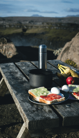
– Terracotta or muted brick in a breakfast nook
– Deep, warm red accent wall in a dining room
– Warm beige or tan that leans slightly toward red or yellow
Probably avoid:
– Neon or heavy traffic-signal red on all walls
– Harsh yellow in a small kitchen if you are light sensitive
Cool colors and calm meals
Blues, greens, and cooler grays:
– Calm the eyes
– Give a cleaner, more spacious feel
– Can make food with warm tones pop
Greens are common in healthier oriented cafes. Blues are used more carefully, since some people find blue less appetizing for food. That said, deep navy in a dining room with warm lighting can look very good.
If you want:
– Relaxed dinners: soft sage, olive, or blue-gray
– A fresh cafe kitchen: cool white with a hint of gray or blue
Neutrals for open concept homes
Many homes in Denver have open kitchens and living rooms. That brings a problem: if you pick a strong color for one wall, it bleeds into other areas.
Neutrals can simple things:
– Off-white with a warm base for shared spaces
– Light greige (gray + beige) for backgrounds
– Slightly darker neutral for the dining area to create separation
Think of neutral walls as the plate, not the meal. Your cabinets, chairs, artwork, and dishes do a lot of the visual work.
Some people think neutrals are boring. I do not fully agree. In restaurant design, the bold parts are often furniture, lighting, menus, not the walls.
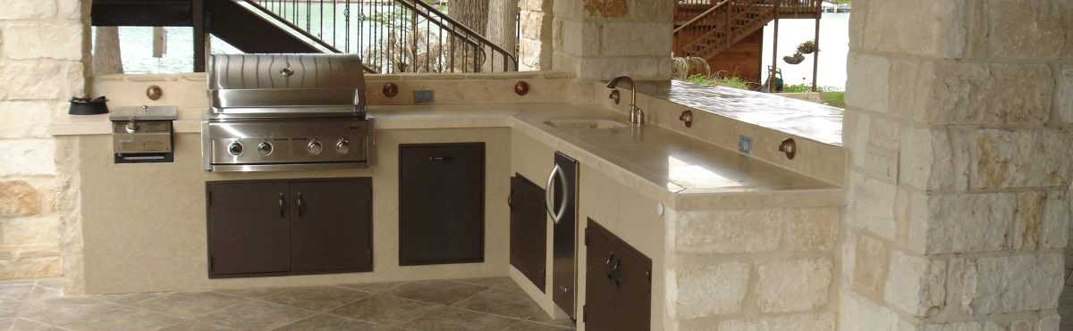
Finishes that survive cooking, steam, and guests
Restaurants repaint more often than homes, but they also choose paint that stands up to cleaning. You should borrow that part.
Basic finish guide for restaurant style homes
| Finish | Looks | Where it works near cooking and eating |
|---|---|---|
| Flat / matte | Soft, hides flaws, not shiny | Formal dining rooms with low traffic, ceilings |
| Eggshell | Slight sheen, still soft | Most dining rooms, living rooms, hallways |
| Satin | More sheen, easy to clean | Kitchen walls, breakfast nooks, kid areas |
| Semi-gloss | Shiny, very wipeable | Trim, doors, sometimes cabinets, not full dining walls |
For a home focused on cooking and hosting:
– Kitchen: satin on walls, semi-gloss on trim and doors
– Dining room: eggshell or matte, depending on how formal you want it
– Open concept: many people pick eggshell across most areas, then satin just near the stove and sink
One thing I learned late: if you put very shiny paint on a less-than-perfect wall, every dent and patch shows up. That is why contractors push eggshell or matte for large walls, especially in older Denver homes.
Lighting and paint: how restaurants cheat a bit
Good restaurants do not rely on paint alone. They use lighting to control how the paint looks.
At home, this matters a lot because most kitchens have different light during the day and at night.
Warm vs cool light on paint
– Warm light (yellowish bulbs) makes warm paint look even cozier, and cool colors can shift slightly green or dull.
– Cool light (bluish bulbs) flatters whites and cool colors but can make warm tones look dirty or muddy.
– Natural light changes through the day. A gray that looks soft at 10 am might turn cold at 4 pm.
If you are going to paint a kitchen or dining area, test color samples:
– Morning and afternoon
– At night with your actual light bulbs on
– Near the stove and near the windows
This feels like extra work, but it can save you from repainting an entire room.
Layered lighting like a restaurant
You have probably noticed how restaurants often combine:
– Overhead lighting
– Wall sconces or side lighting
– Candles or table lamps
You can copy that at home with:
– A main ceiling light or recessed lights for function
– Pendant lights over the island or table
– A small lamp on a sideboard or open shelf in the dining area
The paint you pick should work with all three, not just overhead light. Deep colors with only a single bright ceiling fixture can look flat.
Color ideas for specific spaces
Every home is different, but it helps to see common setups.
Restaurant style kitchen at home
The kitchen is practical first. If you cook a lot, splashes and steam are a constant.
Some reliable wall color directions:
– Warm white with a tiny hint of cream for a cafe feel
– Cool white with a touch of gray for a modern bakery style
– Pale sage, eucalyptus, or light olive for a fresh, calming look
– Very light greige if you want neutral but not cold
Cabinets can carry more color than walls:
– Deep green cabinets with light walls
– Navy or charcoal lower cabinets with white uppers
– Soft gray cabinets with wood accents
Restaurants often keep the kitchen mostly neutral, and bring color into tiles, cookware, and menus. You can do that with dishes, barstools, and textiles.
Practical tip: keep the wall right next to the stove in a more washable finish and paint grade. Some painters quietly use a higher sheen on this one wall so it is easier to clean.
Restaurant dining room at home
This is where you can push mood more. Think about how long you want to sit after eating.
For long dinners:
– Deep green, dark blue, or charcoal on the walls
– Warm lighting and wood tones
– Neutral table and chairs so the room does not feel heavy
For lively, quicker meals:
– Lighter neutrals like warm white or light beige
– Accent color in chairs or artwork
– One deeper accent wall, but not all four
Open shelving or a bar cart against a colored wall can echo restaurant back bars. Just be honest about clutter. If you tend to stack mail and random items, a super dark wall behind that can start to feel messy faster.
Breakfast nook or cafe corner
Not everyone has a formal dining room. You might have a small corner by a window.
To make it feel like a cafe:
– Choose a slightly warmer or darker color than the kitchen around it
– Use a simple bench or bistro table
– Keep the paint behind seating in a finish that will not grab every scuff mark
You can even frame this space visually by painting just that section a different color, like a soft sand tone in a white kitchen.
Open concept homes: how to avoid visual chaos
Many Denver homes have a kitchen that opens to the dining and living room. That is nice for cooking and talking at the same time, but it makes color decisions harder.
Common problems:
– Too many accent walls fighting each other
– Strong kitchen color spilling into living spaces where you want calm
– No clear “zone” for eating vs relaxing
To keep it under control:
- Choose one main neutral for most of the shared space.
- Use deeper colors in limited areas, like a dining wall or behind built-in shelving.
- Connect spaces with matching trim color, even if wall colors change.
For example:
– Main color: soft greige across kitchen and living room
– Dining wall: darker olive or stormy blue
– Trim and doors: crisp white everywhere
This keeps the restaurant feel in the dining area without turning the whole space into a theme.
Practical prep for food centered rooms
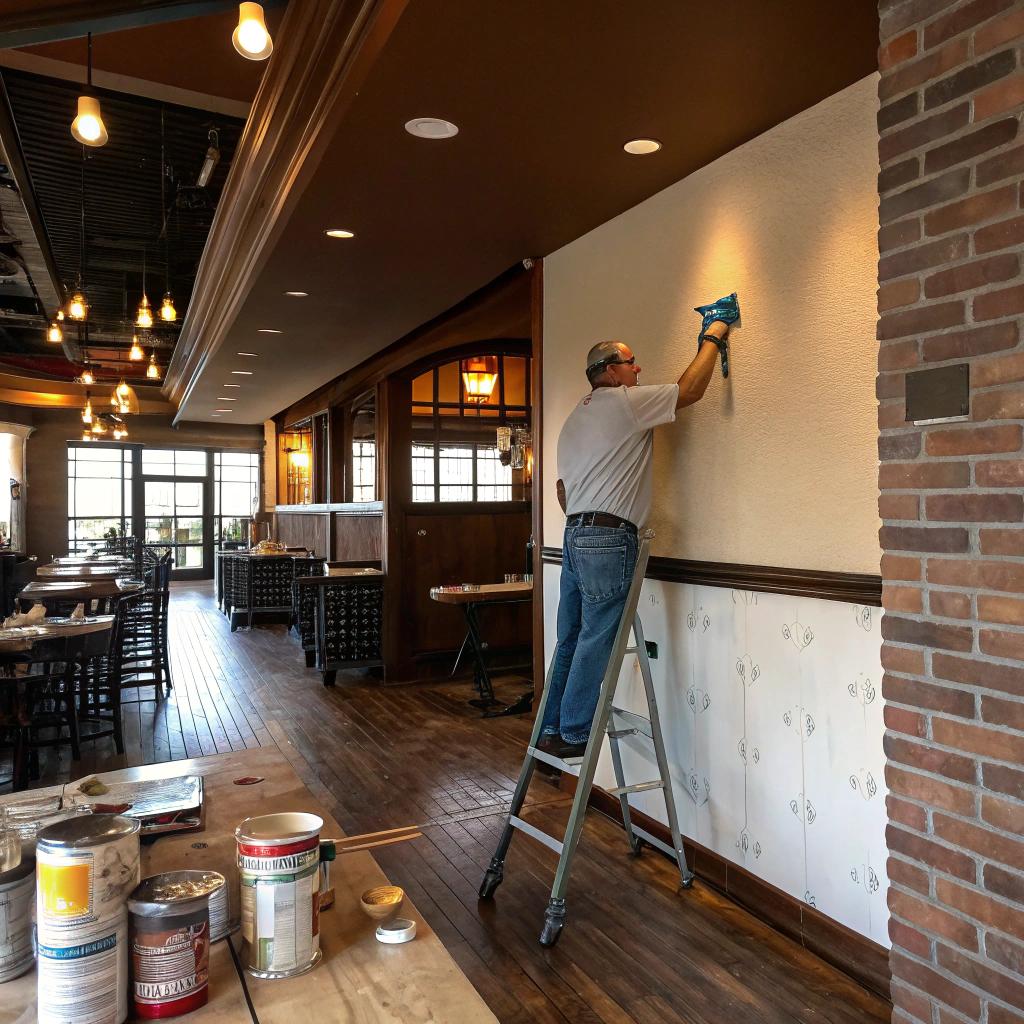
Paint near cooking and dining takes more abuse. Grease, steam, red wine, fingerprints. A good contractor plans for that.
Surface prep that actually matters
This is where some homeowners try to cut corners and regret it. For kitchen and dining spaces, you need:
– Degreasing: Walls near cooking areas must be cleaned before painting.
– Light sanding: Helps the new paint hold, especially in older homes or on patched walls.
– Priming: Important on stained, greasy, or dark colored walls.
If you skip cleaning and priming in the kitchen, you might see peeling or streaking later. Restaurant managers would never allow that, and you probably do not want it at home either.
Picking paints that handle cleaning
You do not need the most expensive product on the shelf, but look for:
– Washable or scrubbable interior wall paints for kitchens and hallways
– Moisture resistant formulas near sinks or dishwashers
– Stain resistance in areas where drinks or sauces are likely to splash
Some brands label certain lines for kitchens and baths. They are usually a bit more durable against steam and wiping.
If you find yourself constantly wiping the same spot by the stove, that spot deserves better paint, not just more scrubbing.
Working with a contractor vs painting yourself
You do not have to hire a contractor. But for larger, open spaces or older homes with patchy walls, a professional can save you time and stress.
When a painting contractor makes sense
Consider getting help if:
– Your kitchen ceiling has stains or old water marks
– You want dark, rich colors that need proper priming
– You have tall walls, staircases, or complex trim
– You want a smooth finish on cabinets, not brush lines
A good contractor will also:
– Test small sample areas for you
– Help choose the right sheen in each space
– Plan the order of rooms so your kitchen is not out of use too long
If you do it yourself, just be realistic about time. Painting a kitchen that you use daily is harder than painting a spare bedroom. You need to plan around meals.
Small restaurant style details you can paint
You do not need to repaint the whole house to get a restaurant feel. Some targeted paint changes can shift the mood.
Painted ceiling accents
Restaurants sometimes paint ceilings darker to lower the visual height and make the space feel more intimate.
At home, you can:
– Paint the dining room ceiling a softer version of the wall color
– Use a slightly darker neutral overhead and keep the walls light
– Add a subtle color band around a pendant fixture
Just be careful with very dark ceilings in low rooms. They can feel cramped if you do not pair them with good lighting.
Color blocked walls
Instead of one flat color:
– Paint the lower part of a wall slightly darker and the upper part lighter
– Create a “panel” of deeper color behind the dining table
– Paint inside a wall niche or shelving unit in a richer tone
This echoes how some restaurants use wainscoting or paneled walls. You get character without committing to full deep color everywhere.
Accent doors and trim
Kitchen or dining doors can act like visual “breaks” between spaces:
– A deep green or black dining room door against lighter walls
– Warm white trim around a rich wall color to keep it crisp
– Painted interior pantry door in a cafe-type teal or muted blue
These small moves often cost less and still change how the space feels.
Keeping restaurant style practical for real life
It is easy to get carried away by photos. I have saved plenty of dramatic restaurant interiors that would never work in my small, everyday kitchen.
A few grounding questions help avoid regret:
– Can I live with this color first thing in the morning?
– Will food stains be obvious on this wall?
– Is my lighting good enough for deep colors?
– Will this work all year, not just in winter or summer?
In Denver, light changes pretty strongly by season. That cool gray that feels nice in August might feel cold in February. Warmer neutrals can be a safer base if you are sensitive to that.
Also, think about cleaning. A glossy black accent wall behind the table looks sharp in photos, but it can show every fingerprint, smudge, and cloth mark. Sometimes a softer finish in a slightly lighter color is less stressful.
Common mistakes when chasing “restaurant style”
You mentioned wanting content that feels honest and not just agreeable, so here are a few areas where people go in the wrong direction.
Copying a restaurant exactly
What works in a 2 hour dining visit may not work for daily life. Deep red walls with low lighting might feel romantic in a restaurant but heavy at breakfast on a weekday.
Take elements, not strict copies. Maybe you like the way a bistro uses dark trim and creamy walls. Bring that home, but skip the near-black ceiling.
Ignoring the rest of your house
If every other room is light and calm, and then your kitchen becomes a dark, moody box, the shift can feel strange. Some contrast is fine, but there should be at least one color or detail tying things together, like shared trim, similar neutrals, or repeating a color in smaller accents.
Too many accent colors
Restaurants often limit their main palette. At home, people sometimes try:
– A bold island color
– A bright accent wall
– Colorful chairs
– Strong patterned backsplash
All together.
That can overwhelm a small or medium space. Pick one or two spots for strong color and let other parts rest.
Sample color combinations for restaurant style homes
Here are a few simple sets you can adjust, not as rules, but as starting points.
Cozy bistro dining and neutral kitchen
– Kitchen walls: warm white
– Cabinets: soft gray or off-white
– Dining room walls: deep olive or muted forest green
– Trim and doors: warm white everywhere
– Metals: brass or brushed gold for lighting and pulls
This works if you like relaxed dinners and use the kitchen all day.
Modern cafe with open concept
– Main walls: light greige through kitchen and living room
– Island: a richer charcoal or deep blue-gray
– Dining wall: only one wall in a slightly darker greige
– Trim: simple, clean white
– Lighting: black or dark bronze fixtures
This fits people who cook often but want a clean, bright backdrop.
Restaurant lounge style dining
– Kitchen: soft, slightly warm white walls, light cabinets
– Dining room: rich navy or charcoal walls, maybe lighter ceiling
– Trim: crisp white to frame the dark color
– Extras: small bar area painted to match the dining walls
Works well if you love hosting at night and do not mind a bit of drama.
Q & A: common questions about restaurant style paint at home
Q: What wall color makes food look best in photos?
A: Soft neutrals usually work best, like warm whites, light grays, or gentle beige. They do not fight the colors of the food. Strong greens or blues can sometimes cast a tint, especially if your lighting is cool.
Q: Should I use the same paint color in my kitchen and dining room?
A: Not always. If the rooms are open to each other, a shared base color can help, but you can still give the dining area a richer tone or accent wall. If they are separate rooms, you can take more risks in the dining space.
Q: Is matte paint a bad idea in a kitchen?
A: In high splash areas near the stove and sink, matte can be harder to clean. In other parts of the kitchen that do not get much direct mess, high quality matte or eggshell can still work. Many people choose satin in the kitchen so they worry less about wiping.
Q: How many colors is too many in a restaurant style home?
A: As a rough guide, 2 to 3 main wall colors across nearby spaces is usually enough. You can bring in more color through furniture, dishes, rugs, and art without painting more walls.
Q: Can a very dark dining room work in a small house?
A: It can, but you need good lighting and some light surfaces to balance it, like white trim, a lighter table, or pale curtains. If your dining room has no natural light and only one ceiling fixture, deep colors might feel a bit heavy.
What kind of restaurant mood do you actually enjoy most, and how close do you really want your home to feel to that?