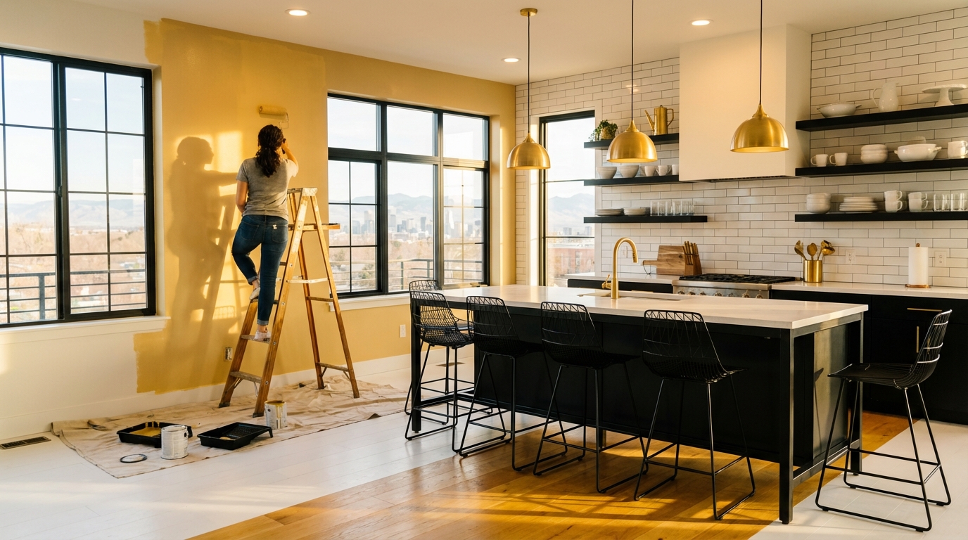
If you want your home to feel like your favorite restaurant, start with the walls. Color, finish, and placement shape the whole mood. In a city like Denver, where light, altitude, and dry air all affect paint, that matters even more. A good starting point is working with a local pro who understands Denver residential painting, but you can do a lot on your own by thinking like a restaurant designer, not just a homeowner.
I will walk through how to bring that restaurant-style look into a Denver home kitchen, dining space, and nearby rooms. I will also touch on finishes that hold up to cooking, how to handle the dry climate, and what actually looks good at night while you are plating dinner or sharing a late snack.
What does “restaurant-style” even mean in a home?
Most people say they want a restaurant-style home, but they usually mean one of a few things. Often it is not about fancy appliances. It is about how the space feels.
Think about your favorite places to eat. If you close your eyes, what do you remember first?
- The cozy lighting over the table
- The way the wall color makes food look warmer or cooler
- The calm background when the place is busy
- The little contrast areas around the bar or open kitchen
Paint supports all of that. In a home, you probably are not changing tables and chairs every year, but you can change paint more easily. Restaurant-style in a Denver house often means:
- Warm, welcoming tones in dining areas that make food look good
- Durable finishes in the kitchen that handle steam, grease, and cleaning
- Accent walls that give your “chef zone” a clear identity
- Calmer, softer colors in nearby rooms so everything is not competing
Restaurant-style painting is not about copying a single restaurant. It is about borrowing the parts that make eating there feel special, then adjusting them to your daily life at home.
How Denver light changes paint color in cooking spaces
Denver has stronger sun and a drier climate than many cities. Colors can look brighter, cooler, or slightly washed out compared to what you see on a paint chip indoors at the store.
Morning vs evening light in a kitchen or dining room
If your kitchen faces east, you will get strong cool light in the morning and softer light later. In the evening, you probably rely more on artificial lighting. That means your paint should look good in both natural and artificial light, which is trickier than it sounds.
Warm whites and gentle earthy tones usually behave better through the day than very bright colors. Strong, saturated shades can feel harsh in midday sun at this altitude, and then too intense under LED lights at night.
| Room direction | Daytime light feel | Better paint temperature | Tip for restaurant-style look |
|---|---|---|---|
| East-facing kitchen | Cool bright mornings, softer afternoons | Warm neutrals or soft warm gray | Use a warm wall color so food looks inviting at breakfast |
| West-facing dining area | Flat mornings, strong golden evenings | Neutral or slightly cool | Pick colors that do not turn too orange at sunset |
| North-facing room | Cool, indirect light all day | Warm tones | Add visual warmth to keep the space from feeling cold |
| South-facing room | Bright most of the day | Balanced neutrals | Use bolder accents in smaller amounts so they do not overwhelm |
I once painted a small Denver kitchen a trendy dark green that looked perfect on Pinterest. In strong afternoon sun, it felt heavy and almost black around the upper cabinets. At night, under bright task lighting, it started to feel a bit like a bar that never closes. The color was not bad, it just did not match the light pattern.
Before you pick any bold restaurant-style color, test it on at least two walls and look at it at breakfast, lunch, and after dinner. If it only looks good for one hour a day, it is the wrong color.
Picking a color palette inspired by your favorite restaurants
If you cook a lot or host dinners, painting is not only about what looks good in photos. It shapes how you and your guests feel in the space while you chop onions or wait for dough to rise.
Think like a menu, not just a color wheel
Restaurants often build the space like they build a menu:
- One main color that carries most of the room
- A few “side” colors that support it
- A small accent or two that stand out
You can do the same at home.
For example, say you love a cozy bistro atmosphere:
- Main: Warm light beige or cream on most walls
- Supporting: Deep charcoal or espresso around a bar area or island
- Accent: Soft red or terracotta behind open shelves or a coffee corner
If you prefer a modern open kitchen like some newer Denver restaurants:
- Main: Clean soft white or pale gray
- Supporting: Matte black or dark navy on lower cabinets or a single wall
- Accent: Muted blue-green or mustard near the dining table or bench
Pick one “hero” space in your cooking area, like behind the range or around the dining table, and give that spot the strongest color. Let everything else step back so the room does not feel loud from every angle.
Finding the right finish for cooking and eating areas
Color gets most of the attention, but finish is what you will deal with when you scrub a sauce splatter or wipe steam marks.
Kitchen walls and ceilings
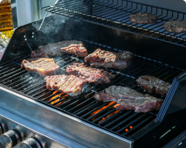
Kitchens take more abuse than any other area tied to cooking. You have steam, oil, and regular cleaning. Flat paint looks nice, but marks cling to it and do not clean off well.
- Eggshell or satin on walls: Easier to clean without being too shiny.
- Semi-gloss on trim and doors: Handles bumps and repeated wiping.
- Moisture-resistant paint on ceilings near cooking zones: Helps resist staining.
In Denver, where air is dry, you might think moisture is not a problem. But inside your kitchen, near boiling pots, you get pockets of humidity that still affect paint over time, especially right above vent hoods.
Dining rooms and breakfast nooks
These spaces often do not face as much grease, so you have a bit more freedom. Many people like:
- Matte or flat for a soft, elegant look in low-traffic areas
- Eggshell if you have kids or often bump chairs into the walls
Matte paint can feel more like an upscale restaurant, especially with deeper colors, but it also shows scuffs. So if you have a narrow dining area where people brush the walls often, eggshell may be a safer choice.
How to link kitchen, dining, and living areas with paint
Open-plan homes are common in parts of Denver, and that can be both helpful and frustrating. You might want a bold restaurant vibe near the island, but you still watch TV or work just a few feet away.
Use color zones, not random patches
Instead of painting one random accent wall because you saw it on a blog, think in zones:
- Cooking zone
- Eating zone
- Relaxing zone
Each zone can have its own feel, but they should still connect.
One simple approach:
- Keep a single neutral that runs through the shared spaces
- Add deeper colors only to vertical surfaces that belong clearly to one area, like the wall behind the cooktop or the wall behind the dining table
- Repeat at least one color in small touches, like baseboards, door frames, or a short hallway
I once saw a Denver condo where the owner painted the kitchen a deep red but left a strange, narrow piece of living room wall the same red. It felt disconnected, like a leftover. When they repainted that little piece in the living room color, everything made more sense. The red stayed in the cooking and eating zone, where it fit better.
Restaurant-inspired wall ideas that work in real homes
Some restaurant tricks translate well into homes. Others do not. Stainless steel walls in a small condo kitchen, for example, might look impressive on TV but feel cold and echoey next to your couch.
Accent walls behind the table
A common restaurant move is to use a stronger color or texture behind seating. You can borrow that idea for a dining nook or eating bar.
- Deep blue or navy behind a built-in bench
- Soft terracotta or clay behind a farmhouse table
- Charcoal or dark olive behind a small round table
This anchors the seating area and gives your plates and food a nice visual backdrop. Warm colors often make dishes look richer, but cool colors can help if you already have a lot of warm wood and yellow light.
Painted “frames” around cooking areas
Instead of painting a whole wall dark, you can paint a section that outlines your stove, hood, or open shelving. Something like a 4 to 8 inch strip of color can act as a frame, almost like how some restaurants frame the pass window between the kitchen and dining area.
This is especially helpful if you rent and do not want to repaint entire rooms later. You can keep your main wall neutral and still have a strong restaurant-style moment around your cooking station.
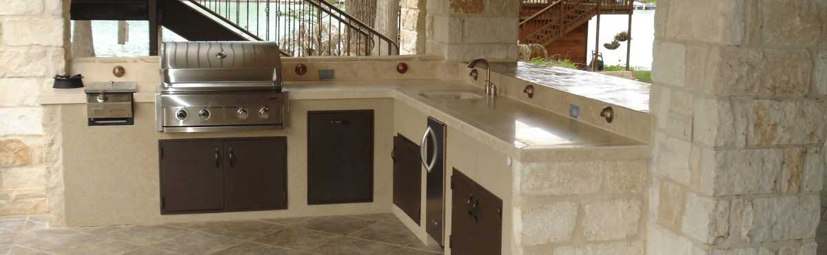
Combining paint with tile or stone
In many restaurant kitchens, tile does the heavy work near high heat and splatter, while paint softens the rest of the space. At home, you can do the same:
- Use tile or stainless around the range and sink splash zone
- Use washable eggshell paint on the surrounding walls
- Shift to a slightly warmer or deeper color as you move from kitchen into dining
The key is not to let every surface fight for attention. If you have a busy patterned tile, pick calm paint. If your tile is very simple, you have more room to play with color on the walls.
Neutral vs bold: what works best for eating and cooking?
Restaurants often do something you might not expect: the walls are more quiet than the brand or the signage. Bold color is used carefully. At home, it is tempting to paint everything in a dramatic shade, but that can tire your eyes, especially in strong Denver light.
When to choose neutrals
Neutral does not mean boring. It usually just means the color is soft enough that it does not pull all your attention. That can be good if:
- You already have bright cookware, art, or open pantry shelves
- Your kitchen is small and you want it to feel larger
- You work from home near the kitchen and need a calm background
Warm grays, soft beige, cream, and greige work well in Denver because they can handle strong daylight without looking too harsh.
When to go bold
Bold color makes sense when you want a clearly defined “restaurant corner” in an otherwise quiet home. That might be:
- A deep color on the dining wall in an open-plan living area
- A dark pantry or coffee bar tucked off the main kitchen
- A painted ceiling in a small breakfast nook
I think bold works best in controlled doses. If you paint both cabinets and walls in a heavy color, it can look striking in photos but tiring in everyday life. It is similar to eating a very rich dessert every single night. Nice once in a while, not so great all the time.
Dealing with Denver’s dry climate when painting
Denver has dry air and noticeable temperature swings between day and night. That affects how paint dries and how it holds up, especially near cooking areas.
Drying times and touch-ups
In low humidity, paint can feel dry to the touch faster, but that does not mean it has cured fully. If you scrub or tape over it too soon, you can damage the surface.
- Give walls more time before scrubbing food stains off
- Avoid heavy cleaning products in the first few weeks
- If you need to tape for backsplash work, wait as long as you reasonably can
This is one place where people get frustrated. They paint over a weekend, cook a big meal a few days later, and then try to scrub a mark aggressively. The paint is not ready for that, and it starts to peel or show shiny marks.
Cracking, gaps, and caulk lines
Dry air can pull moisture from caulk faster, which might cause slight cracking along trim or between walls and cabinets. A clean caulk line makes your restaurant-style kitchen look more finished, so it is worth doing right.
- Use good quality paintable caulk
- Let it cure fully before painting over
- Check high-movement areas like corners and cabinet edges once a year
Lighting: how your paint and food actually look at night
Restaurants pay attention to lighting for a reason. Light affects how we see food, skin tone, and color. Many homes skip this step and rely on one bright ceiling fixture that flattens everything.
Layered lighting near painted surfaces
Think in layers:
- Overhead lighting for general brightness
- Task lighting over counters and stove
- Accent or mood lighting over the table or island
If you are going for a cozy restaurant feel, try slightly warmer bulbs over the table and more neutral white in the kitchen work area. Your paint should look decent under both, which is why testing paint samples next to your actual light bulbs is worth the small hassle.
| Lighting type | Where to use | Paint tip |
|---|---|---|
| Warm (2700K – 3000K) | Over dining table, bar, breakfast nook | Pairs well with warm neutrals and earthy colors |
| Neutral (3500K – 4000K) | Main kitchen work areas | Helps colors read closer to daylight |
| Cool (above 4000K) | Rarely ideal for restaurant-style spaces | Can make warm colors look dull or strange |
A paint color that looks great in the daytime might feel too yellow or too gray under your bulbs. If your favorite restaurant feels warm and flattering, notice if their lighting is slightly dimmer and warmer than what you have at home.
Practical prep tips for high-use cooking areas
Painting a home kitchen or dining space in Denver is not very different from other cities, but the same basic rules still apply. A restaurant-style look will fall flat if the prep is sloppy.
Clean surfaces more than you think
Kitchen walls collect a thin layer of grease and dust, even far from the stove. Paint will not stick well to that. Use a degreasing cleaner, rinse, and let everything dry. Ceiling areas near vents also need real cleaning, not just a quick wipe.
Sand and prime where it counts
- Glossy areas around previous backsplashes or trims need sanding
- Stains from smoke or water need stain-blocking primer
- Patch holes and smooth them so light does not highlight every bump
This part is not glamorous, but it is what separates a restaurant-style finish from a rushed weekend job that looks dull after a few months.
Small restaurant-style details you can paint, not buy
You do not always need new furniture or decor to change the mood. Simple paint moves can bring your house closer to that feeling you like in a favorite cafe or bar.
Painted shelves for cookbooks and dishes
If you have open shelves or can add some, painting the back wall behind them a deeper color turns them into a small display area. Restaurants often show bottles, cookbooks, or plates behind a bar or host stand. You can echo that idea with:
- A darker tone behind white dishes
- A quiet neutral behind colorful cookbooks
- A warm color behind wood or wicker baskets
Contrasting trim and doors
Many restaurants use darker trim or door colors to frame movement in and out of the kitchen. In your home, painting the door to a pantry or mudroom a distinctive shade can create a similar effect.
- Dark gray pantry door in an otherwise light kitchen
- Soft black baseboards in a dining room with cream walls
These small changes can make your space feel more designed without touching the main furniture.
When to call a pro vs when a DIY approach is fine
Some people paint everything themselves, others hire help for almost all of it. For a restaurant-style home, it might be worth mixing both approaches.
DIY-friendly tasks
- Small accent walls
- Single-color dining rooms without tricky trim
- Touch-ups away from cabinets and tile
Better left to pros
- Kitchen ceilings and areas around built-in hoods
- Tight spaces between cabinets and appliances
- Complex color transitions in open floor plans
If your goal is a home that feels as put-together as a well-run dining room, the straight lines and clean edges matter. Crooked trim, patchy color, and paint on hardware can ruin the effect, even if the color choice is great.
Common mistakes when aiming for a restaurant-style look
Trying to copy a restaurant vibe at home can go sideways in a few predictable ways. Here are some traps to avoid.
Copying a theme too literally
You might love a pizza place with bright red walls and tons of wall art. That does not mean your small condo kitchen should look exactly the same. Commercial spaces handle heavy color with higher ceilings, stronger ventilation, and different furniture.
Borrow the mood, not the exact design. Maybe you keep the warm reds in smaller touches, like a painted door or a single wall, instead of coating every surface.
Forgetting how you actually cook
If you fry a lot, make stock, or bake frequently, you will have more steam and splatter than someone who mostly makes quick salads. Your paint and finish choices should fit your habits, not a fantasy version of your kitchen.
I have seen people paint a wall behind a stove in flat paint because they liked the velvety look. It looked great for a week. Then oil spots started to show and would not clean off. A small adjustment to eggshell or satin would have saved them from repainting.
Ignoring adjacent rooms
You might focus on the kitchen and dining room so much that you forget about the hallway or living room right next to them. When you stand in the doorway, everything needs to work together. That does not mean every room has to match, but they should not clash.
Questions you might still have
Q: Can I paint my small Denver kitchen a very dark color and still get a restaurant-style feel?
A: You can, but I would be cautious. In a small space with standard ceilings, very dark colors can make it feel tight, especially in strong daylight. If you really like dark tones, try limiting them to lower cabinets, one accent wall, or the dining side of the room. Keep the ceiling and at least some walls lighter so the space can breathe.
Q: What is one simple paint change that makes a home feel more like a restaurant?
A: Painting the wall behind your main dining area a different color from the rest of the room usually has a strong effect. It instantly defines the table as a special place, closer to how restaurants frame their seating. Combine that with slightly warmer lighting over the table and the difference is clear, even if nothing else changes.
Q: How do I know if my paint colors are helping my food look better, not worse?
A: Test them during a real meal. Put plates of food on the table, turn on the lights you normally use, and look at the walls, the table, and the plates together. Do the colors fight each other, or does the food stand out in a good way? It is a simple check, but it is closer to how you live than staring at a sample board in the afternoon.